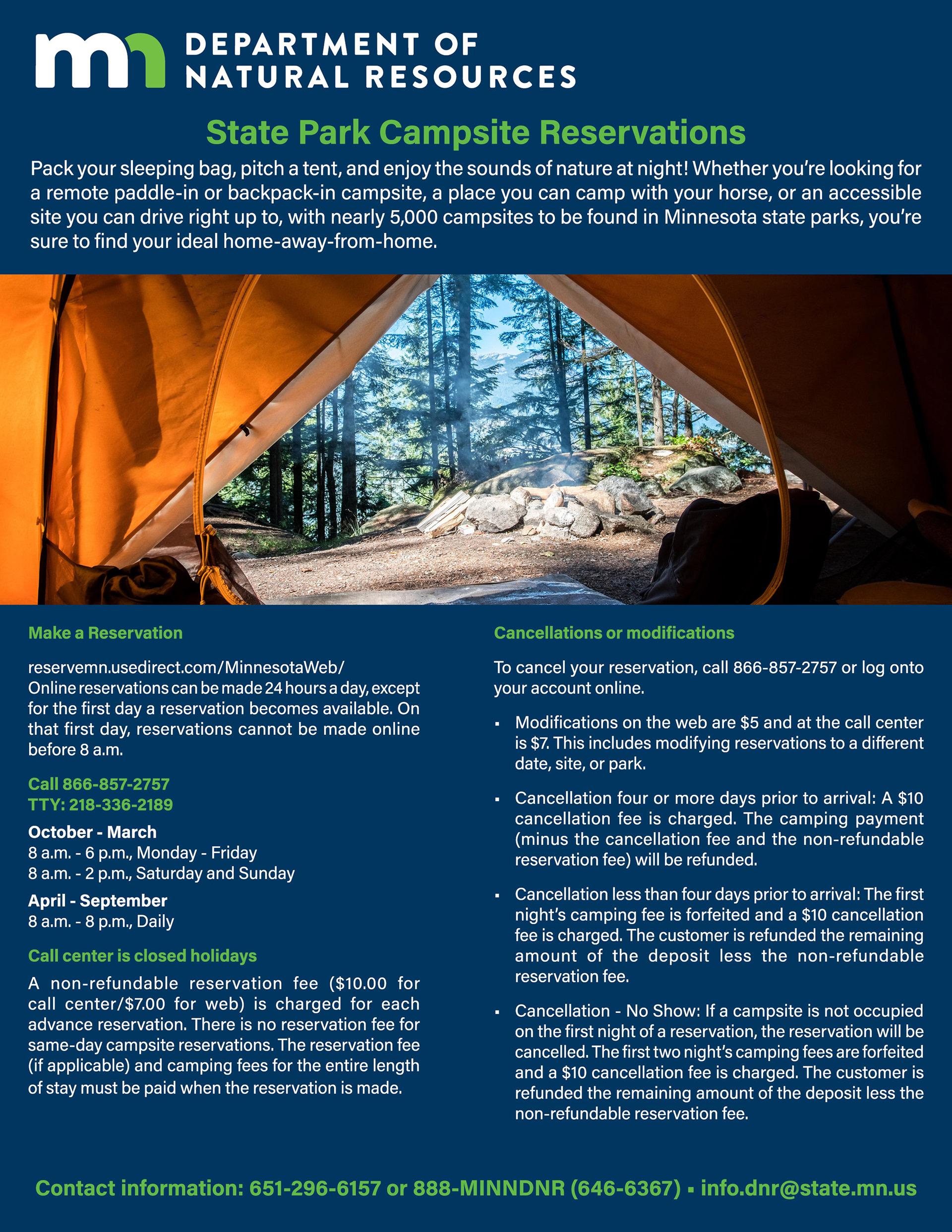
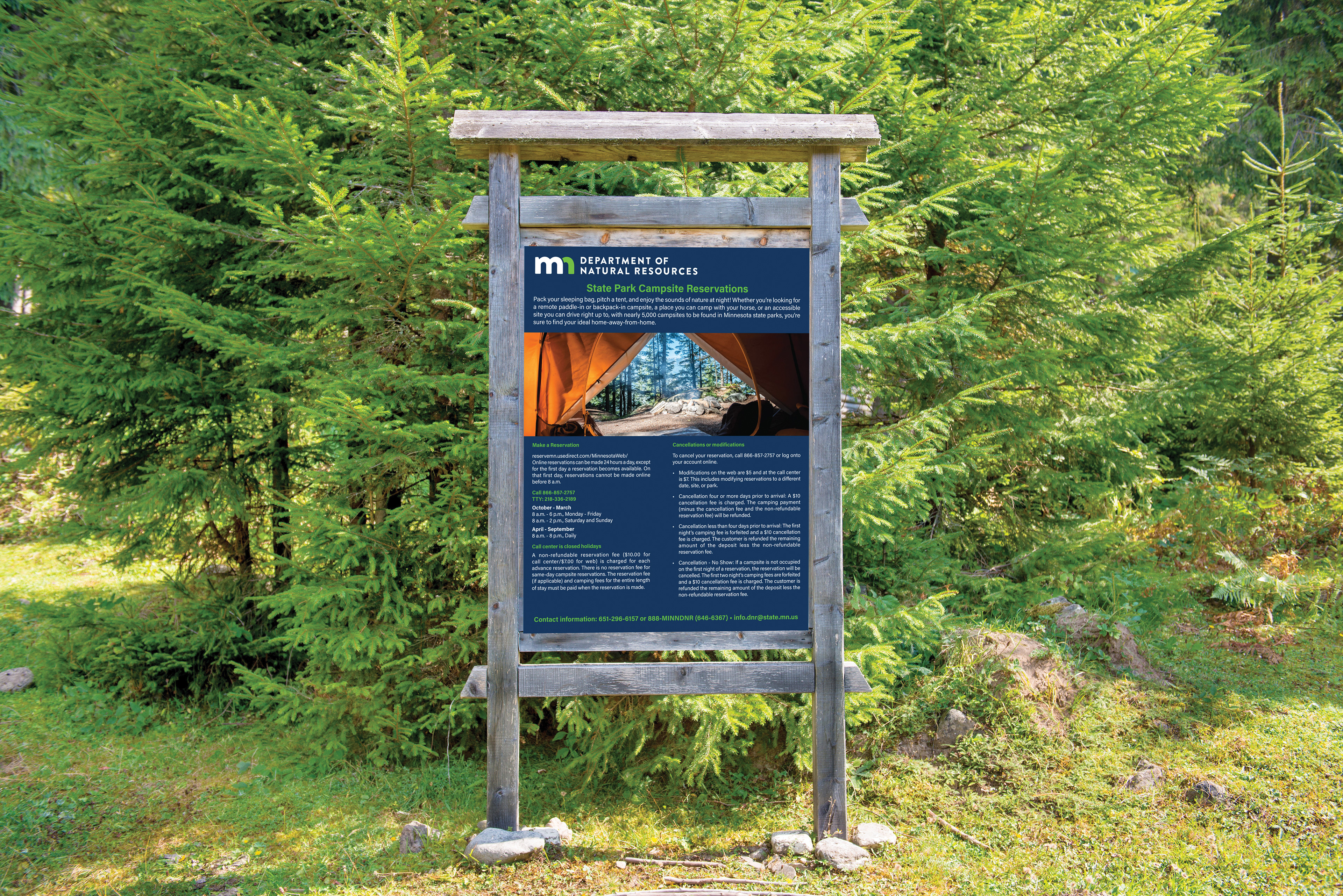
For this project, the Minnesota Department of Natural Resources needed an informational flyer on state park campsite reservations. The client supplied the body copy, logo, and a few potential images to use.
I used hierarchy to emphasize the logo at the top of the flyer followed by stating the purpose of the flier, which was how to make Minnesota State Park campsite reservations. I used the Minnesota State Brand Color Palette which I found online to emphasize their brand identity for accuracy and consistency. I used one large image to draw the eye in and then followed with a two column body copy for the details. Using color contrast for subheadlines and bullet points made the body copy more legible. Finishing with the contact information at the bottom.
Software Used: Adobe InDesign
