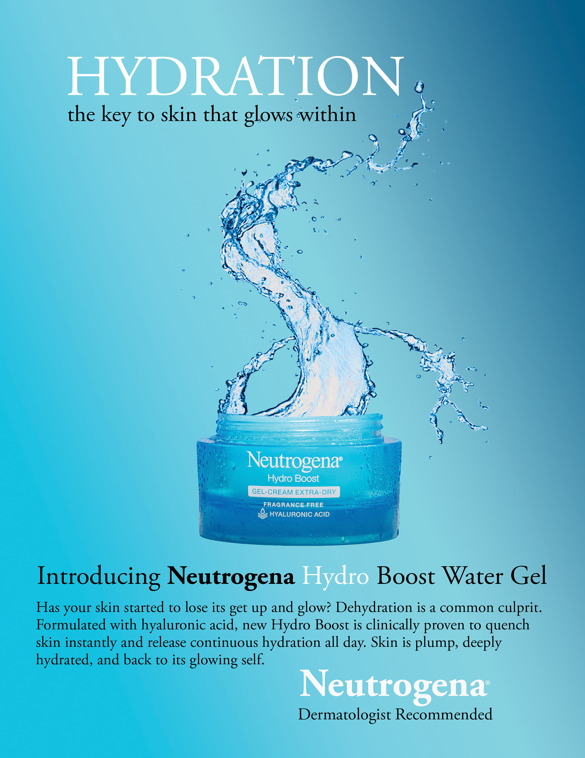
The goal of this project was to create an image composite from 2-3 images that seemed like it was originally one image - except that it really couldn’t be because of an unusual scale or combination.
I looked online at numerous advertisements before I decided on Neutrogena Hydro Boost Water Gel. I chose this product for this project because I immediately visualized how the end product would look. I knew I wanted the emphasis to be on hydration for the skin, which to me, meant water. I wanted to create the look of water flowing up and out of the jar, which I was able to achieve through masking. I used the rules of composition in my layout to make the flowing water the focal point. Scale and hierarchy in the HYDRATION text directs the eye with leading lines down the water flow to the product and body copy. I repeated the white font color in hydration, product label, hydro, and Neutrogena logo to draw emphasis by contrast along with consistency. Overall, I was pleased with the visually interesting image and message it portrays.
Software used: Adobe Photoshop
