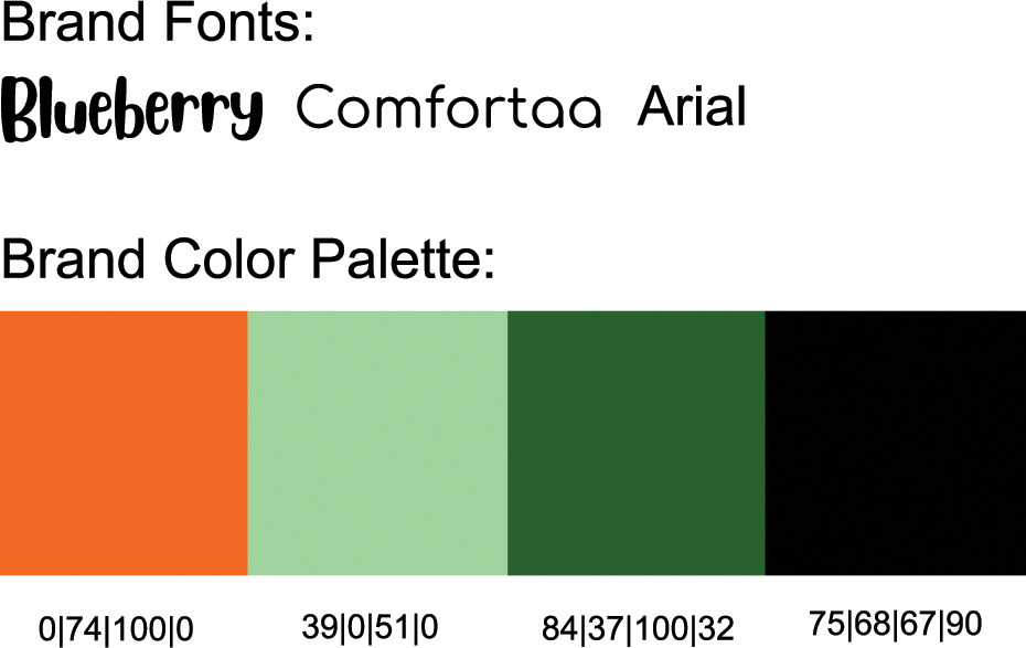
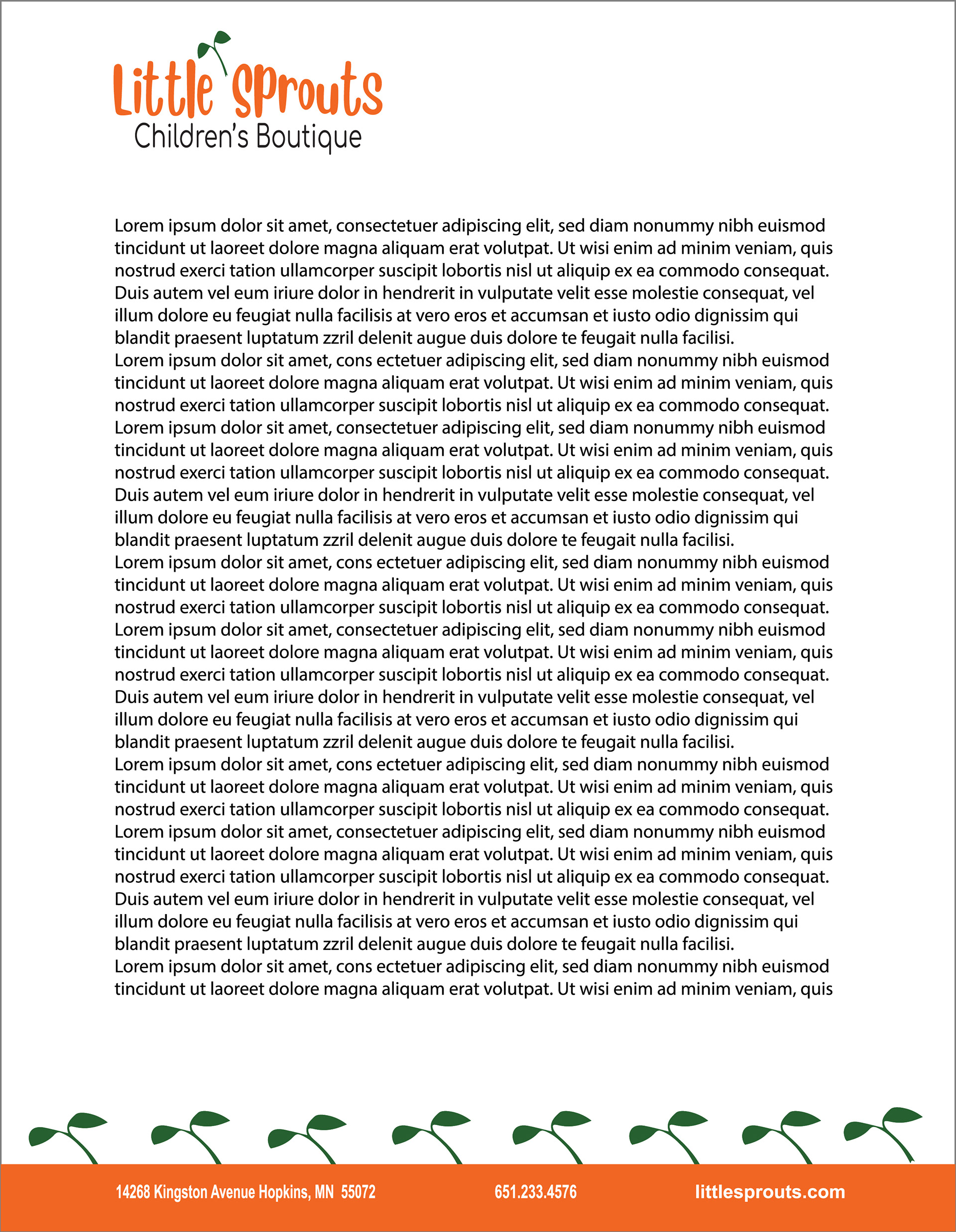
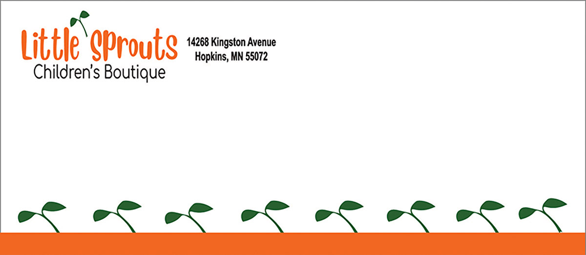
Little Sprouts was the name our class decided to base a branding project around. The task was to design a brand for Little Sprouts Children’s Boutique through creating a color palette, brand fonts, logo, business card, letter template and mailing envelope. Once these pieces were created the final step was putting them in an aesthetically pleasing branding board for presentation.
After deciding Little Sprouts was the boutique name, the first image in my head was of a little plant sprout and that’s where I started. thought a little plant sprout symbolized a little baby growing to maturity. For the color palette, I based it around green for the sprout and wanted a bright contrasting color to pop the name along with black and white. It was fun adding sprouts to the business card, letterhead, and envelope for continuity. I felt the overall look and style of the end project portrayed the branding for a children’s boutique that I was working towards.
Software Used: Adobe Illustrator
Software Used: Adobe Illustrator
